A CLASH OF SYMBOLS
by Ed Reiter
Symbolism.
To critics of the U.S. Mint’s uninspired coin designs, it’s an element sorely missing from the nation’s new coinage in recent years.
Members of both the federal Commission of Fine Arts (CFA) and the Citizens Coinage Advisory Committee (CCAC) have urged the Mint to return to the allegorical portraits of Liberty and other powerful symbols that graced the greatest U.S. coins of the past, such as Augustus Saint-Gaudens’ stunning double eagle and eagle.
To the U.S. Mint, however, “symbolism” seems to have a whole ’nother meaning. This hit me as I pondered the Mint’s curious claim of trademark protection for the phrase “America the Beautiful” as it pertains to the new Washington quarters honoring national parks and historic sites.
Mint officials have brandished this claim like a club, threatening to bludgeon any dealer or seller of supplies who dares to use the expression “America the Beautiful Quarters” in packaging and marketing the coins.
The only symbols that matter, from the Mint’s point of view–or so it would appear–are ™ and ®, the symbols for “Trademark” and “Registered Trademark.”
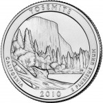
If this is the case, why not just stamp one of these symbols on each and every “America the Beautiful” quarter or similar insipid creation? It would be at least as artistic as the fancy outdoor bidet on the Hot Springs quarter or the high-rise molehill on the Grand Canyon coin.
While they’re at it, the crack Mint artists might consider labeling key elements of the designs, so people who get the coins can tell, for instance, which jagged lines are supposed to be mighty mountains and which flat spaces are limpid lakes. As things stand now, one bad design blends into the next like so many ramshackle buildings along Skid Row–hardly the beautiful America they’re intended to depict.
Good designs were few and far between in the 50 State Quarters® Program. The six quarters issued for the District of Columbia and five U.S. territories ranged from tolerable to terrible. But as we near the end of the first year of the America the Beautiful Quarters™ Program, it’s evident already that far from being an American Idol, this is the Biggest Loser.
Not one of the six coins issued or previewed so far is remotely beautiful. Ghastly, garish, god-awful, yes. But it’s hard to imagine any beholder whose eye would find beauty in these.
Come to think of it, there is one group that might find this “artwork” worth a closer look: archaeologists who study the scratchings on the walls of ancient caves.
Mint officials declined a request to be interviewed about the trademark issue. But in a written response, a spokesman told COINage that the Mint applies for trademarks to “protect the integrity and image of its intellectual property, build and enhance its brand identity, clearly distinguish its products from those of private mints and other businesses and identify itself as a component of the U.S. government.”
I’m having trouble figuring out just what “intellectual” has to do with this particular property. And given the dismal designs on recent U.S. coins, I can’t imagine why any private mint would want to be confused with Uncle Sam’s.
Perhaps the Mint’s ineptitude is, itself, a symbol. A sign that in modern society, the overwhelming emphasis is on meeting tight deadlines, not high standards. A sign that with so many different coin programs being authorized, some involving dozens of new issues, quantity is pushing quality out of the picture.
I guess that’s one big reason I view the trademark dispute with especially jaundiced eyes. At a time when it should be focused on creating better designs, the Mint is wasting time and effort playing legal chess games straight out of Alice in Wonderland.
Could it be that the Mint’s lawyers, rather than its artists, are the biggest culprits here? If they used fewer resources tilting at legal windmills, would the artists be more inspired to reach beyond the bland and the banal?
Whatever it is that led us to this unhappy pass, one thing’s undeniably true:
A mint is a terrible thing to waste.


